Very Peri – Pantone Colour of the Year 2022
Colours are hugely subjective; they are not definitively nice or not nice, good or not good – it depends on how you see them and how you feel about them, and the associations they have for you.
Take purple, for instance. Purple sits in the territory created when you mix fiery, passionate red with cool, calm blue.
The cool and calm cancels out the passion, leaving us with a sort of neutral purple. My wife isn’t a fan of purple; she owns no purple clothes, and there’s an absence of purple in the house, though many years ago we did have an aubergine feature wall in a flat in London. I think feature walls in aubergine were all the rage back then…
“Purple has strong historical associations with luxury and royalty. Going back to ancient times it was incredibly hard (and hence expensive) to produce the colour purple. ”
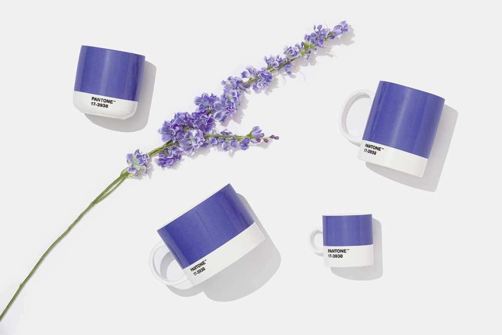
Anyway – back to purple, and in particular, Pantone 17-3938, aka Very Peri – Pantone’s Colour of the Year for 2022.
If you’ve not seen it yet, take a look at Pantone’s Instagram feed – at least the last ten or so posts feature objects and animations bathed in this particular cute, shiny shade of purple.
Pantone describes it as a “new colour whose courageous presence encourages personal inventiveness and creativity”. I like this description, though I confess I’m not entirely sure I know what it means. Nonetheless, we talk a lot about being courageous, inventive and creative here at NUA.
Purple has strong historical associations with luxury and royalty. Going back to ancient times it was incredibly hard (and hence expensive) to produce the colour purple.
As a result, fabrics and clothes made from the dye were exceptionally rare and literally worth their weight in gold. Asprey of London use it as their brand colour which seems appropriate. Cadbury’s Dairy Milk also use purple, which arguably seems less so.
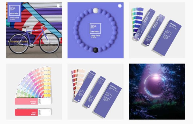
Pantone Insta feed
Image: Pantone Instagram feed
Pantone explain Very Peri’s character further: “A colour for our transformative times – a symbol of the global zeitgeist of the moment and the transition we are going through. – the merging of the physical and digital world.”
The Colour of the Year, chosen very carefully as it is, can have an enormous influence on branding, communication and product development. One wonders what ideas, products and brands might emerge coated in Very Peri… I’ve decided I like it. Not sure why, but I do. I guess it’s subjective.
Meet our academic Makers & Creators (opens in a new window)All images credit to Pantone