
Four student winners in Society of Publication Designers Awards 2022
The Society of Publication Designers Awards invites creatives across the world to enter. Based in New York, entries are judged by art directors working in publishing and magazine design.
Building upon last year’s win, four BA (Hons) Design for Publishing students are successful in this year’s awards.
The Society of Publication Designers (SPD) is an organisation dedicated to creatives who specialise in visual storytelling.
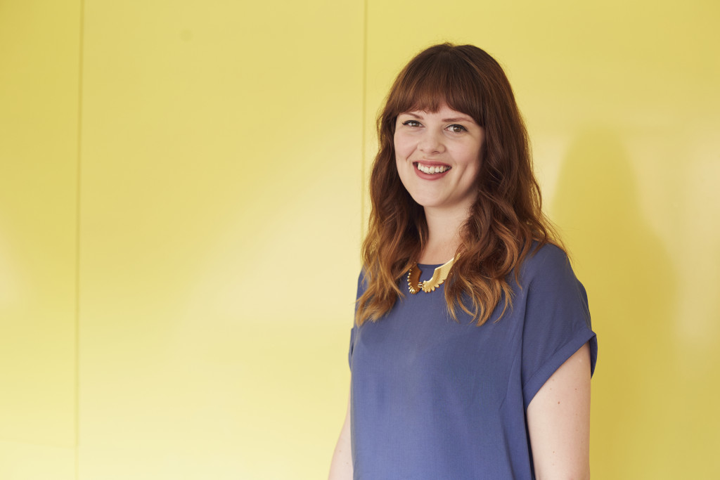
Winner first place: Chloe Leeder
Chloe Leeder
Chloe Leeder
Chloe Leeder
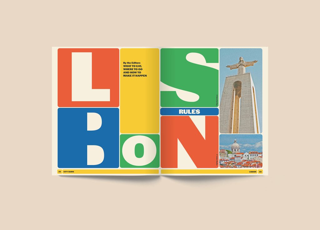
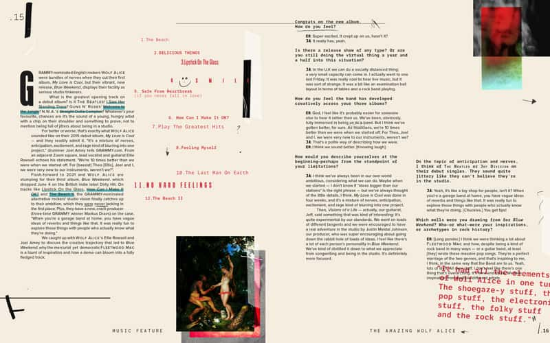
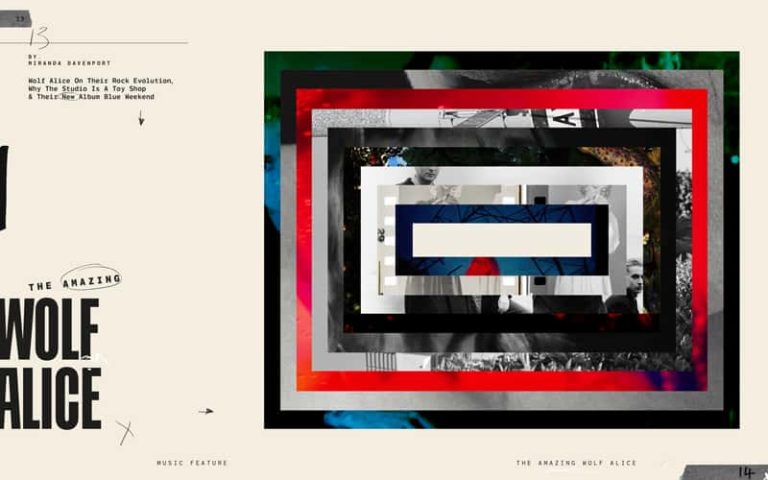
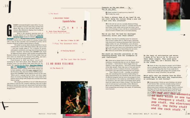
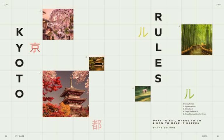
Chloe wins first place with her editorial design for the alternative rock band Wolf Alice. Additionally, she receives a Noteworthy Mention for a second project titled ‘Kyoto Rules’. The prize for winning first place is mentoring over the summer months, along with $1,200 (approx. £980), and a feature on the SPD website.Winner second place for Animated Gif Illustration: Willow Hall
Willow Hall
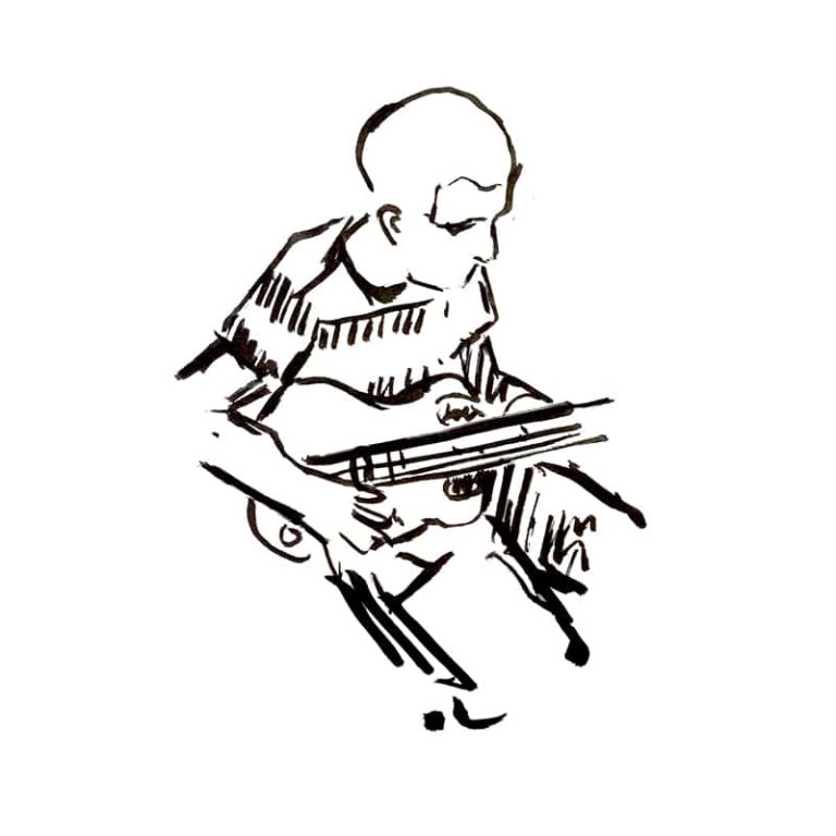
Willow’s short stop motion animation of a man playing the guitar won second place in the animated gif category of the awards.Winner third place: Lily Leeks
Lily Leeks
Lily Leeks
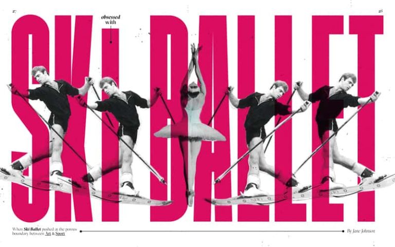
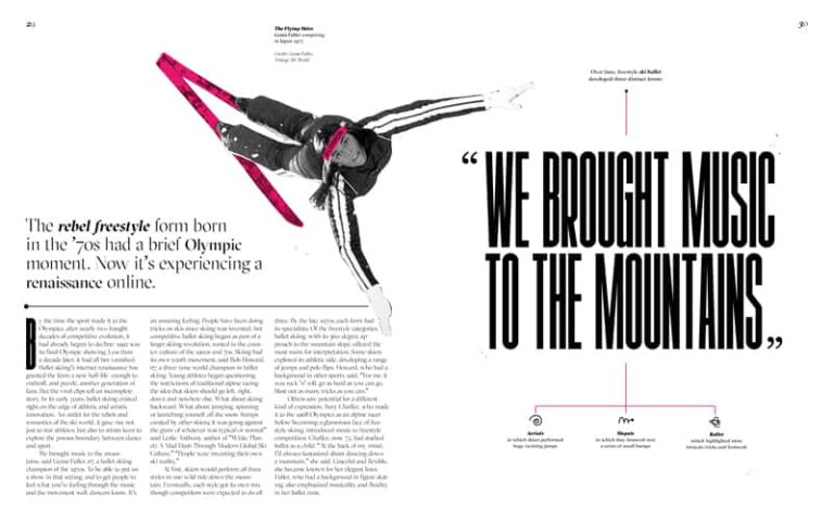
Lily’s editorial design for Ski Ballet comprises bold typography and a creative use of imagery, winning her third place in the competition. Both Lily and Willow’s projects will be featured on the SPD website, and each student will receive a portfolio review by an SPD board member.Noteworthy mention for two projects: Skye Williams
Skye Williams
Skye Williams
Skye Williams
Skye Williams
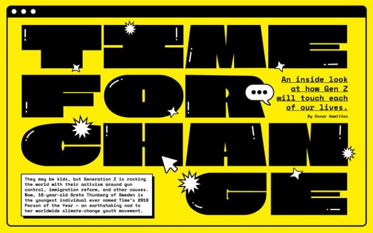
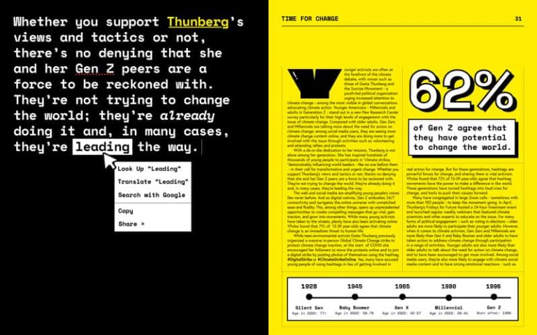
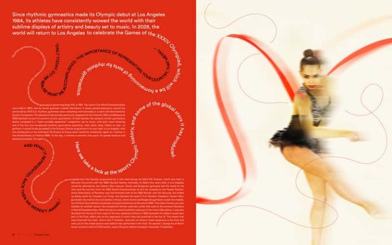
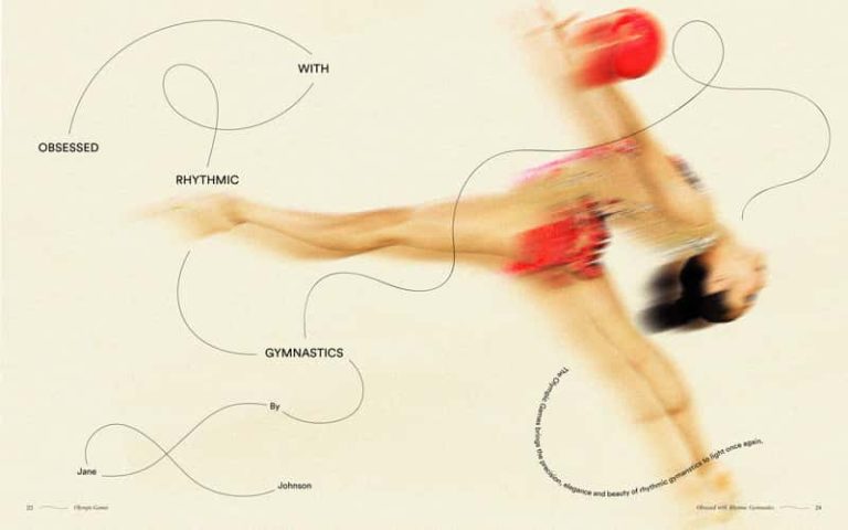
Skye Williams receives two noteworthy mentions for separate projects: one design depicting the digital age that Gen-Z lives in, and another on rhythmic gymnastics. Explore BA (Hons) Design for Publishing (opens in a new window)Tags:
Related News
-
 BA Photography •
In conversation with: Joe Coleman, BA (Hons) Photography graduate
Joe tells us about his current work and how the skills he learned at Norwich have helped shape his practice in computer generated imagery. -
 Alumni •
In conversation with: Carrie Clarke, MA Fine Art Graduate
MA Fine Art graduate Carrie Clarke reflects on her experience at Norwich University of the Arts, from exploring new materials to building confidence in her practice as a sculptor. -
 BA Animation •
Success for Norwich Graduates at Royal Television Society East Student Awards
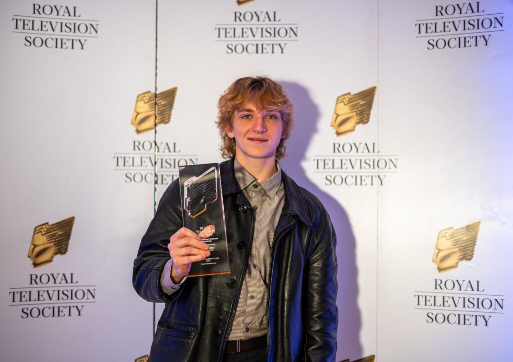
Norwich students were nominated across seven categories, with Henry Schwind, a graduate from BA (Hons) Film and Moving Image Production, winning the Craft – Camerawork category. -
 East Gallery •
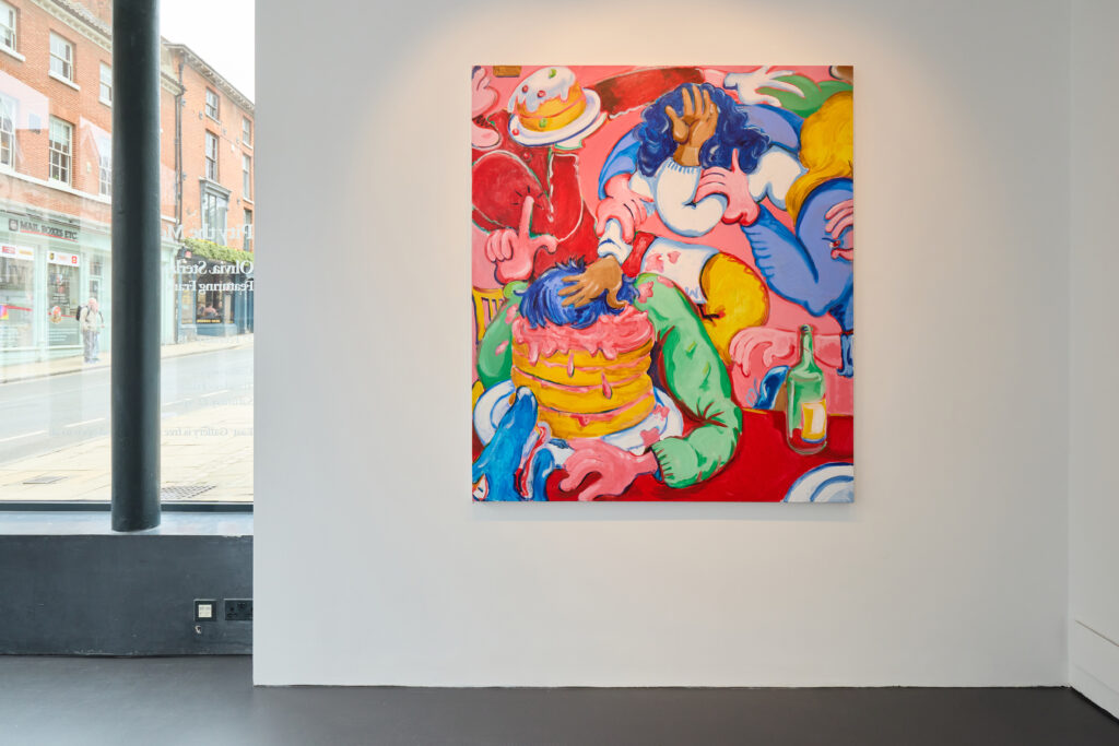
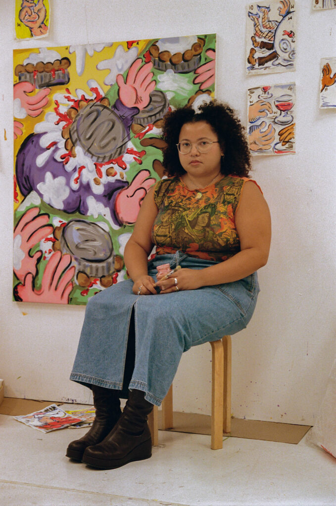
Culture in Norwich: East Gallery
Claire Allerton, East Gallery Curator, discusses everything our city-centre art space has to offer – and why a visit to Olivia Sterling’s Pity the Meat! exhibition is a must this spring. -
 Alumni •
Norwich ranked in QS World University Rankings for Art and Design
Norwich University of the Arts has been ranked in the 201–300 band globally for Art and Design in the latest QS World University Rankings by Subject, marking its first-ever inclusion in the internationally recognised ranking. -
 MA Communication Design •
In conversation with: Bevan Dolon, MA Communication Design
Bevan shares his design influences, creative practice and experience studying a postgraduate degree at Norwich University of the Arts. -
 East Gallery •
Sterling vs Bacon: Artists in dialogue in Olivia Sterling’s Pity the Meat! Exhibition
Pity the Meat! sees artist Olivia Sterling’s work in dialogue with the 1959 Francis Bacon painting, Two Figures in a Room. Eddy Frankel, art critic and former art and culture editor for Time Out, explores what brings them together – and sets them apart. -
 BA Animation •
Access and representation in a changing landscape: How women can shape the future of computer arts and technology
Access and representation remain central issues for the computer arts and technology industries. Helen Piercy, Animation Lecturer at Norwich, explores the opportunities emerging for graduates in a rapidly changing landscape. -
 Institution •
Director of Research Development collaborates with TED-Ed on new animation
Professor Alison Goodrum worked with the TED-Ed team to develop the short film which explores the history of hats. -
 Institution •
Norwich University of the Arts showcases institutional and research achievements to Research England
The University was delighted to welcome representatives from Research England, to share key institutional and research developments. -
 Institution •
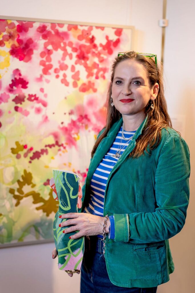
Norwich appoints new Deputy Vice-Chancellor
Norwich University of the Arts is pleased to announce the appointment of Rebecca Wright as its new Deputy Vice-Chancellor. -
 BA Textile Design •
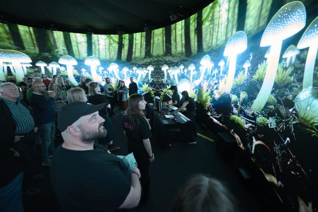
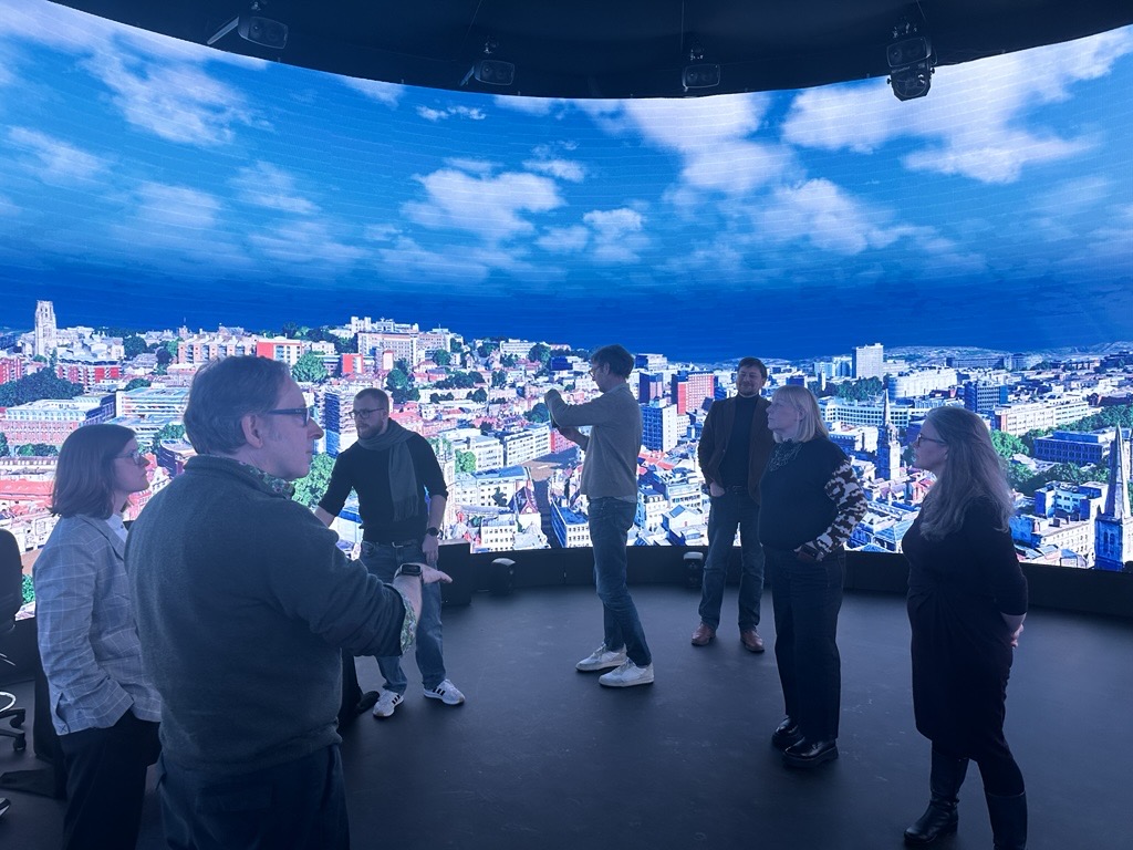
In conversation with: Lucy Perry, MA Textile Design
Lucy shares her experience of creating a 360° digital installation, in a collaborative exploration of nature and technology. -
 Institution •
Norwich University of the Arts earns prestigious 5-star QS Star Excellence rating fo Teaching
Norwich University of the Arts has been awarded an overall four-star rating in the prestigious QS Stars University Ratings, marking a significant milestone in the University’s first-ever submission to the internationally recognised assessment framework. -
 Employability •
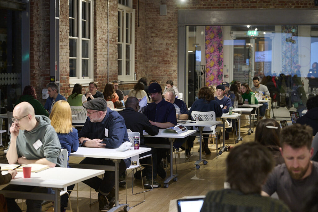
Norwich University of the Arts celebrates 10 years of the Big Book Crit
Hundreds of Norwich students have shared their work with leading creative professionals over the last decade. -
 East Gallery •
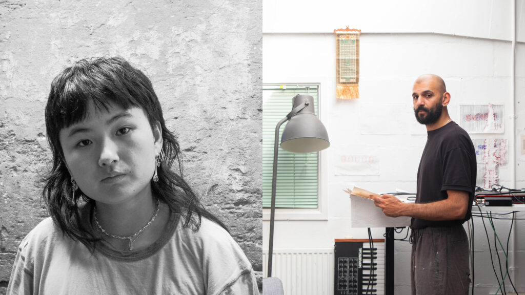
Announcing the East Gallery Fellows 2025-2026
Norwich University of the Arts is pleased to announce the selected awardees of this year's East Gallery Fellowship. -
 BA Business Management •
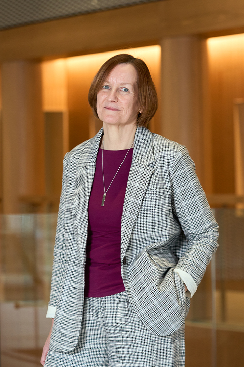
Dean of Creative Education Awarded Prestigious Principal Fellowship from Advance HE
The University is delighted to announce that Hilary Carlisle, Dean of Creative Education and Professor of Design, has been awarded Principal Fellowship of the Higher Education Academy (PFHEA) by Advance HE
1 / 1
Related courses
- Showing 1-2 of 4 results
-
-
Undergraduate
-
Full time
-
September
-
Design for Publishing
Design for Publishing BA (Hons)
Explore how words and images can come to life on the page and screen to tell stories and deliver information.
-
-
-
Undergraduate
-
Full time
-
September
-
Graphic Communication
Graphic Communication BA (Hons)
Ignite your passion for exploring visual ideas and brand communication from real-world problems to commercial briefs, across digital and print.
-