Our story
Norwich University of the Arts emerged in the 19th century from a thriving tradition of craft and artistic activity in the city of Norwich. Today that flame of creative exchange burns brighter than ever.
We are engaged in the dynamic debate about the nature and future of creativity through different practices and disciplines, established and emerging art forms, research, and experimentation.
This debate is vital because the world around us is changing. Creative practitioners play an essential role by questioning, interpreting and responding, activating change to pave the way to a better, more sustainable future.
Through joy and enterprise, great thought and great action, our radical culture and diverse community encourage us to understand what is, imagine what could be — and then shape the world.
We empower our staff and students in their intellectual and personal growth, by equipping them with confidence, resilience and creative thinking. We believe that diversity in all its forms is at the heart of creative endeavour, ensuring we see the world differently and give form and voice to new possibilities.
Making strategy visible
Rebranding is a natural part of a university’s evolution. Priorities, focus and outlooks all change as we grow, and these changes need to be reflected in the brand.
co-creating
Co-creation and collaboration have been at the heart of this project. Every member of our community played an integral role in the creation of our new brand.
We engaged stakeholders through interviews, surveys, and ‘town hall’ forums throughout each phase of the project. They were given the opportunity to critique and reflect on the ongoing work, ensuring a collaborative and inclusive approach to our brand development.
We are proud of what we have achieved together, a new brand that captures the ethos of our community, acknowledging our history and embracing our fresh and forward-thinking perspective to creativity and creative arts education.
“Our main objective was to create an inclusive and representative process to arrive at a new brand proposition, set of values and clear objectives for a creative brief identifying what a new brand identity needs to achieve for the University in order to support its ambitions and goals. A key part of the process was a thorough evaluation of the current name to ensure the University becomes synonymous with the city of Norwich.”
Jo Marsh, Director of Winster Marsh
Brand idea
Creative exchange
Together, with our design partner North, we have crafted our new guiding brand ethos “creative exchange.”
This powerful concept encapsulates the spirit of curiosity that permeates the Norwich community, inspiring us to explore, question, and make a profound impact on the world around us.
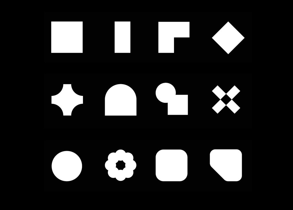
Visually it comes to life through a simple and modular layout system whose main goal is to champion the work of Norwich. It features a bespoke font and visual language designed to represent the diverse crafts and disciplines taught here. Unique forms intertwine, reflecting the exchange and overlap that characterise Norwich’s creative core.
The guiding idea is expressed verbally through a tone of voice that poses big questions. It orients towards ideas and actions; it looks to the future and listens to others with empathy and an open mind.
“Our goal was to bring the identity of this historic institution into the 21st century and it required a revolutionary approach to spark change. The entire creative process was shared together with the university resulting in an identity framework that provides structure while also creating space for expression and shared ideas. As a whole, the new identity embodies Norwich’s history and the insatiable curiosity that drives conversations and challenges conventional thinking.”
Sean Perkins, Founding Director of North.
Value proposition
shape our world
Through creative exchange we equip our community with the critical creativity, confidence and resilience to look at the world differently and give form and voice to new possibilities.
Our values
Our brand values are the foundational beliefs that we stand for. These values underpin and guide everything we do at the University.
Radical mindset
We support our community to challenge conventional thinking. By asking questions and pushing boundaries, we unlock new realms of creativity and innovation.
Mutual respect
Diversity in all its forms is at the heart of the creative process. By respecting, listening and learning from different perspectives, we create a more resilient and equitable community.
Joyful invention
We celebrate the experience of joy and energy in the creative process. We are enterprising and take inspiration from established and emerging technologies and partnerships.
Self determination
We strive to create a culture where everyone has the confidence and agency to find their voice and determine their creative and professional potential.
How we sound
How we sound is grounded in who we are and the things we value. Our voice reflects a focus on creativity, ideas, and actions.
It reflects our confidence and pride in what we do — we’ve got a lot to say, and we need to make ourselves heard across all communication channels.
We are:
- Questioning
- Confident
- Attentive
Logo
The old university branding has been in place since 2009, designed by Jim Sutherland of Studio Sutherland, and has served us well for almost 15 years.
However, a lot has changed for the university in that time. The new bold logo is future facing and has been design with a focus on longevity, flexibility and expression.
Typeface
Following a thorough exploration process that yielded more than 50 font prototypes, Jonathan Leonard, a talented Norwich alumnus from the class of 2020 and designer at North, crafted the custom typeface ‘Exchange’.
‘Exchange’ is more than just a typeface; it powers our entire design system. It embodies a spectrum from focused to abstract expressions, seamlessly merging Norwich’s rich historical heritage with the continuous cycle of inquiry and creativity that characterizes our community. ‘Exchange’ stands as a testament to our dedication to innovation and provides a visual embodiment of our critical creativity.
“The new identity poses questions about the fusion of traditional and digital art forms.”
Jonathan Leonard, Norwich University of the Arts graduate and North designer
Digital
Digital creativity forms the centrepiece of our reimagined identity.
Coding and digital tools are not merely complementary elements, but crucial components in the creation process. They will be instrumental in producing generative visuals that add a unique dimension to our brand.
This lays the foundation for an extra layer of innovation, enabling a broader spectrum of expression and exploration.
Colour
Norwich University of the Arts new official colour palette is powerful and concise, comprising a classic combination of black, white, and grey, complemented by a vibrant yellow.
This yellow hue carries a profound legacy in the city’s history. When the master weavers — Strangers — fleeing persecution in the Low Countries were offered a home and a place to ply their craft in Norwich, they brought with them yellow canaries. The colour has been synonymous with the city ever since.
Questions?
If you have more questions about our new identity email our marketing team