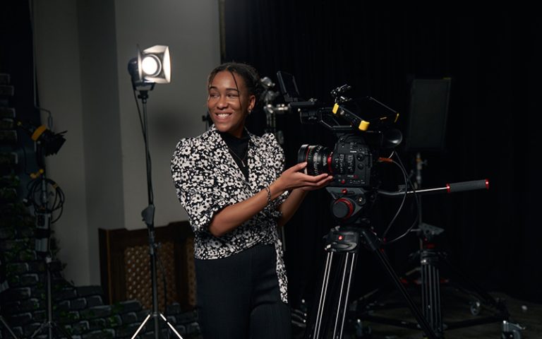
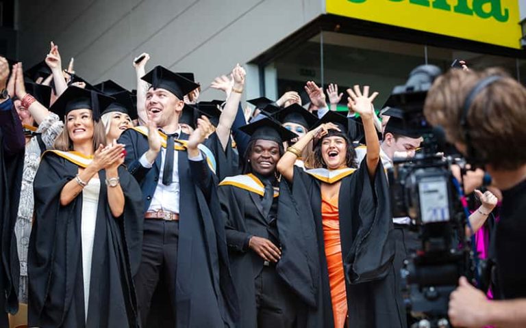
Norwich graduate discusses her work in the industry and her journey as a lettering artist
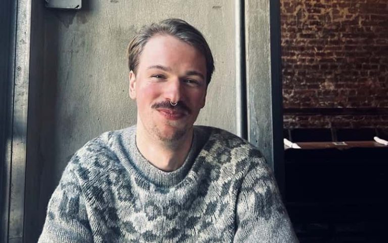
Rachel Joy Price graduated from BA (Hons) Graphic Design in 2011. She returns to Norwich University of the Arts to speak to students and discuss how she has since gone on to specialise as a lettering artist after being inspired by her Great Grandfather, Walter, who was a sign writer.
Industry advice
After graduating Rachel spent the first seven months in internships and although at the time she worried about getting a full-time job, she highlights how valuable that experience of working in different studios is because of the connections that were made. She describes this process as “full circle” because some of those contacts have invited her back to work on projects as a lettering artist years later.
Rachel defines her work as “painting bold joyful words that are inspired by sign paintings.” She reiterates what a lettering artist is from her perspective and states it as “anything to do with letters” whilst pointing out that her practice is broader than typography. It also incorporates crafting type for brands to help them form letters that portray emotion, character and personality to represent their products and identity.
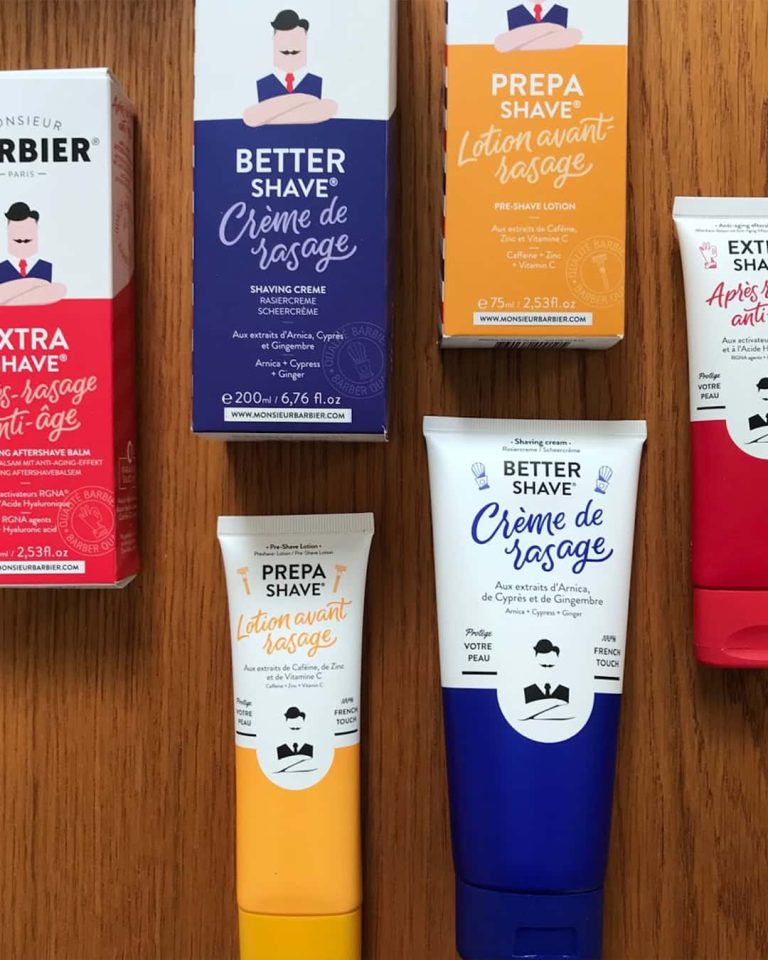
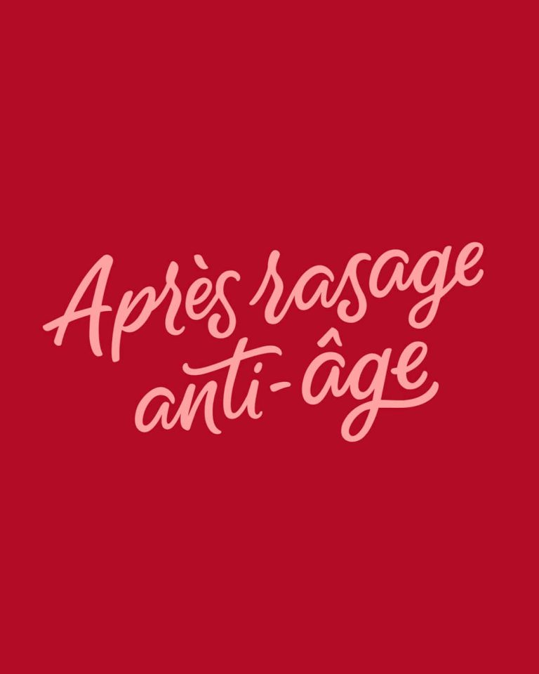
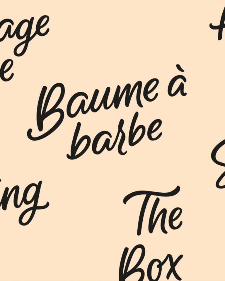
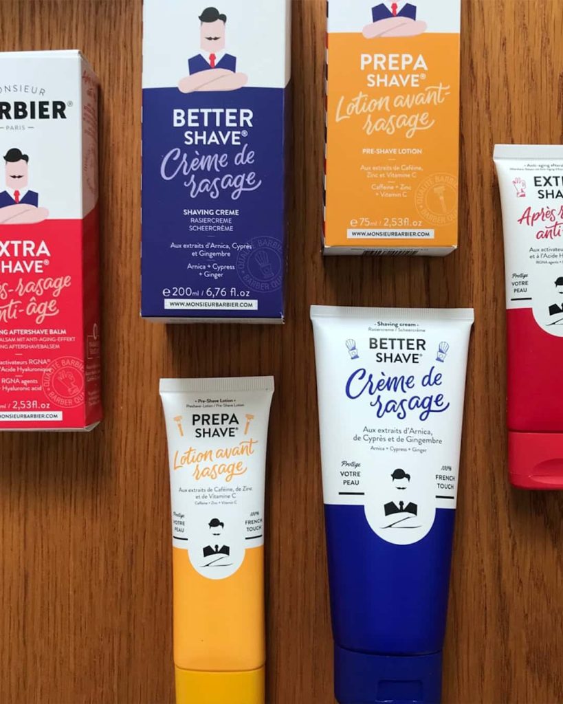
A weekend course in sign painting and an iPad Pro led Rachel to build a portfolio where she began to sketch and paint, which pushed the boundaries of her creative practice. Whilst still working as a Senior Designer she would respond to briefs with mainly typography ideas. “I started to get a taste for what it might be like to be a letter artist.” A job that coincided at this time was for Monsieur Barbier, a French brand looking to elevate their type. A student on BA (Hons) Illustration, Adam Avery, who studied at the same time as Rachel recommended her for the job.
“You never know who in this room is going to get you work down the line”
Rachel Joy Price, Graphic Design graduate
Rachel recalls a moment when she was taught how to pick out pantones; she realised the subtle nuances and endless options of colour which has gone onto shape and inform her own understanding of colour within her practice. She advises to turn work upside down to consider the space and enforces how these techniques will help with your understanding of how the design agencies work and the processes they go through before getting in-touch. “I’m not the hero that comes in and crafts the type, it’s really collaborative.”
Self-employed industry work
In 2017 Rachel made the leap to go self-employed and hasn’t looked back. At the beginning the work was mainly crafting type for brands and recalls some of those earlier projects.
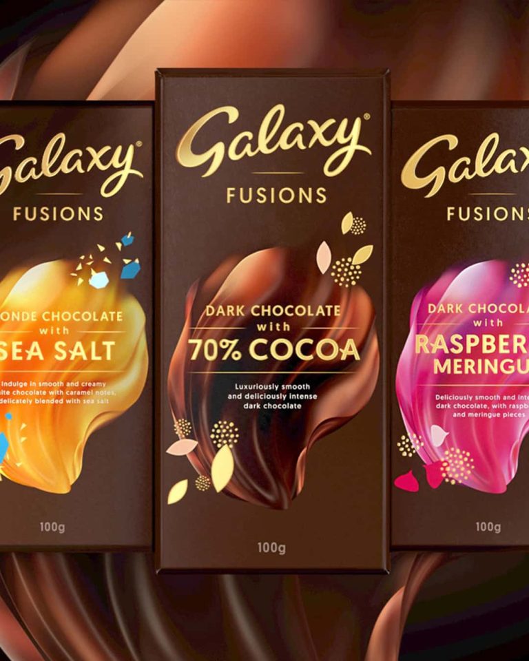
Galaxy being one of those projects, working with Elmwood on some initial sketches to see how far the client was willing to push the type, led Rachel to create the final artwork as it sits on packs today.
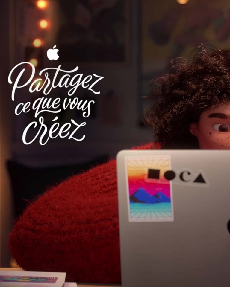
In addition, Media Arts Lab, who were working on Apple’s 2018 Christmas advert approached Rachel to produce the endlines for the advert, which went out in several different languages. The advert was an animation of a young girl and aimed to address female roles within the creative industry.
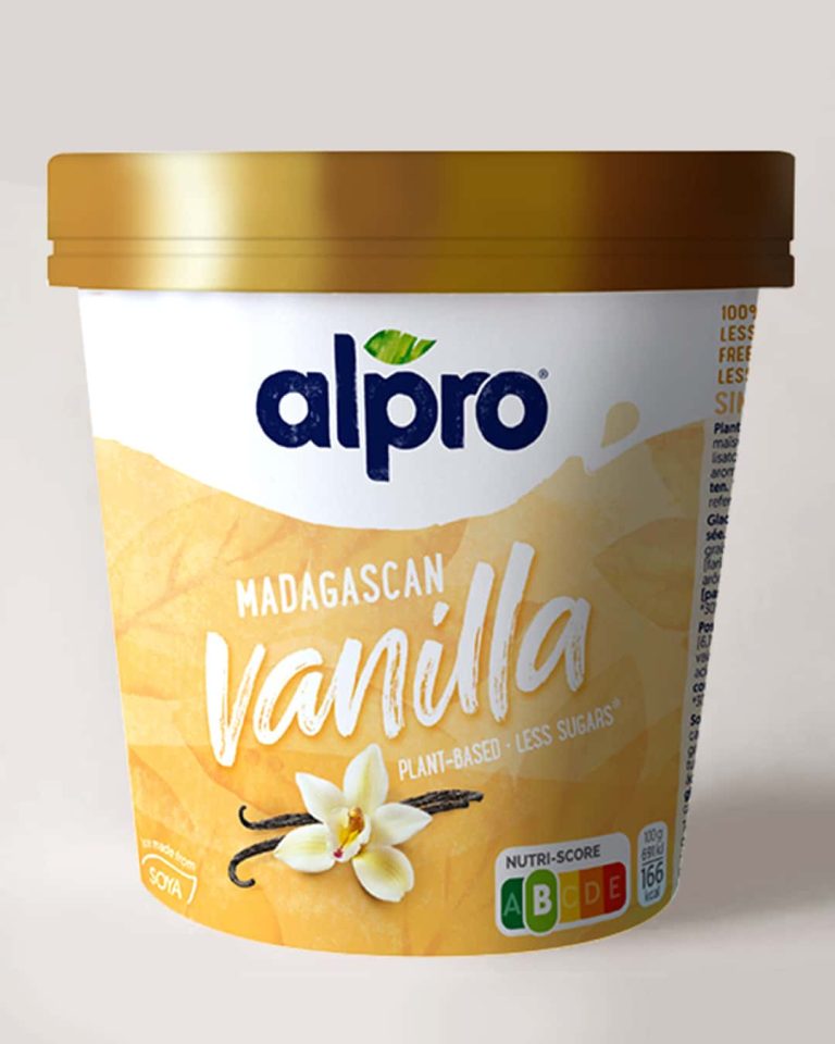
Having worked as a designer, Rachel enjoys the projects with design agencies, such as Elmwood whom she worked with on Alpro. She crafted the type for their ice cream products. This project took Rachel back to the basics of working with ink and paper. She emphasises how the designs couldn’t be achieved digitally and not to discard working with traditional methods and resources.
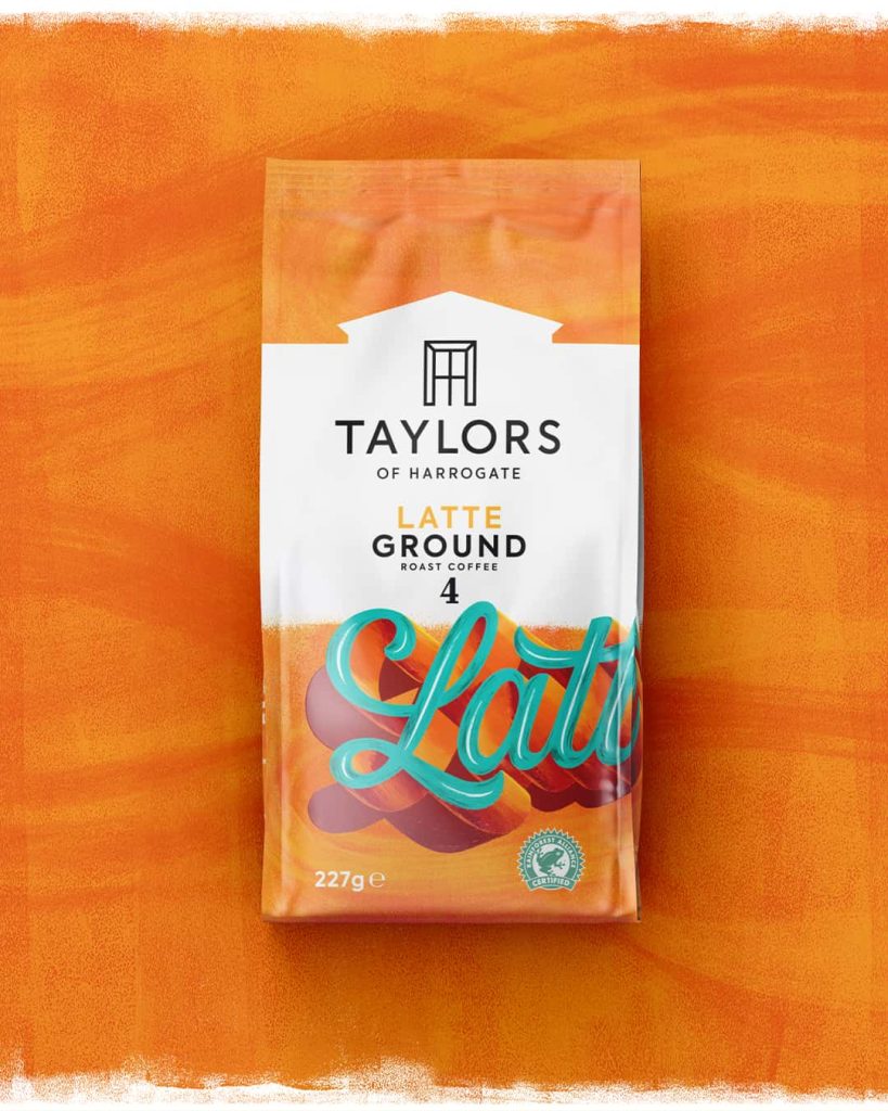
Further to this, Rachel discusses her involvement and role with Turner Duckworth’s redesign of Taylors of Harrogate’s coffee packaging. Rob Clarke, another lettering artist, had crafted the vector version of the type which was then passed onto Rachel to hand paint onto large canvases. The lettering had to be physically painted to capture the authenticity of old sign writing that the brand wanted to translate. The finished paintings were photographed in sections to retain the texture from the brush strokes.
Refining her style
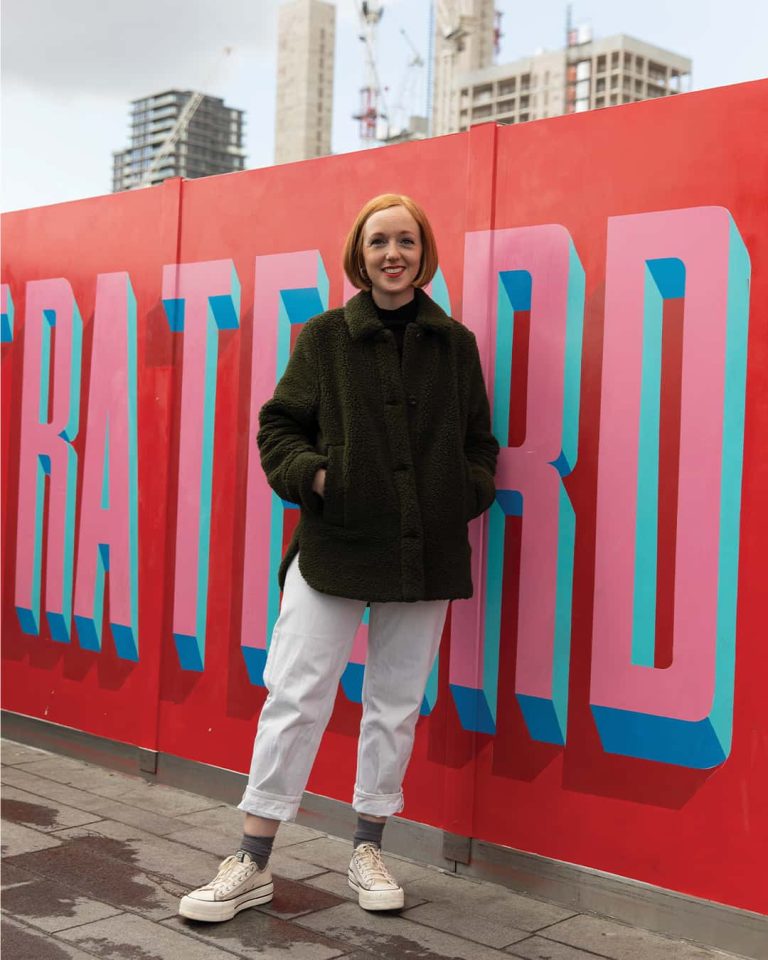
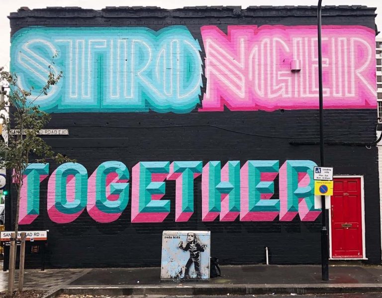
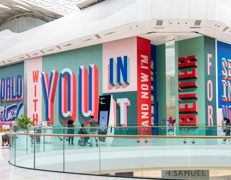
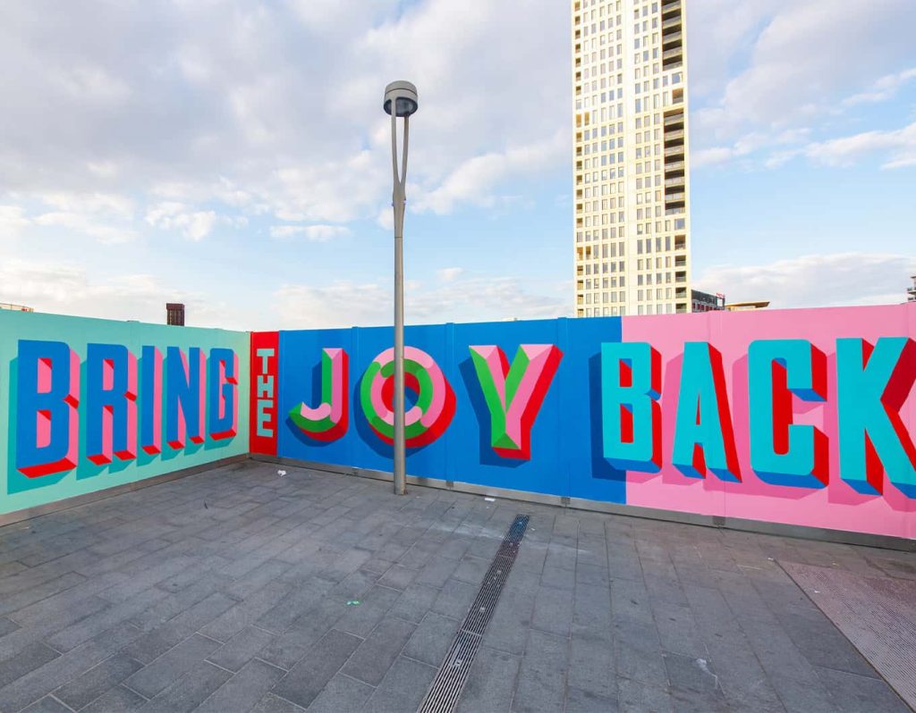
A significant part of Rachel’s practice has been refining her style, which took her onto discuss a project with graffiti artist Ben Eine. “I wouldn’t consider myself as a street artist, but it’s really nice to be given these canvases in public spaces.” Having never used a spray can before Rachel explained, “it’s a whole other art, to learn the control and precision.” This led Rachel to work on more outdoor canvases which includes her message ‘bring the joy back’ she painted for Westfield Stratford shopping centre for the re-opening of the shops, after the Covid-19 pandemic.
As a result of this, Rachel was asked to design and come up with more up-lifting phrases to cover empty store units in Westfield, West London. She mentions how often she receives positive messages and photos of strangers next to her work. “I still can’t quite believe the size of that project, the joy, for me as an artist that’s the reaction I want.”
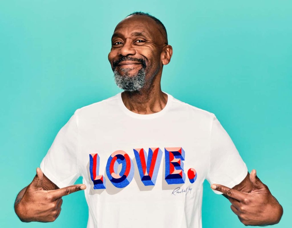
Finally, Rachel states “the sweet spot for me, is when those two parts collide, working with brands but also working as an artist.” This is evident in Rachel’s work for Comic Relief’s 2022 Red Nose Day, where she was asked to design a t-shirt, she describes this moment as the ‘epitome’ of projects.
“I absolutely loved my three years at Norwich. You are all so very lucky to be here, I still feel lucky to have been able to come here. You are so well connected to the industry and to be able to step straight into it.”