
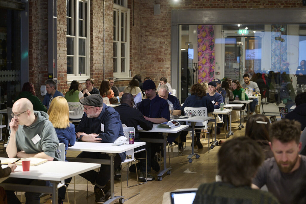
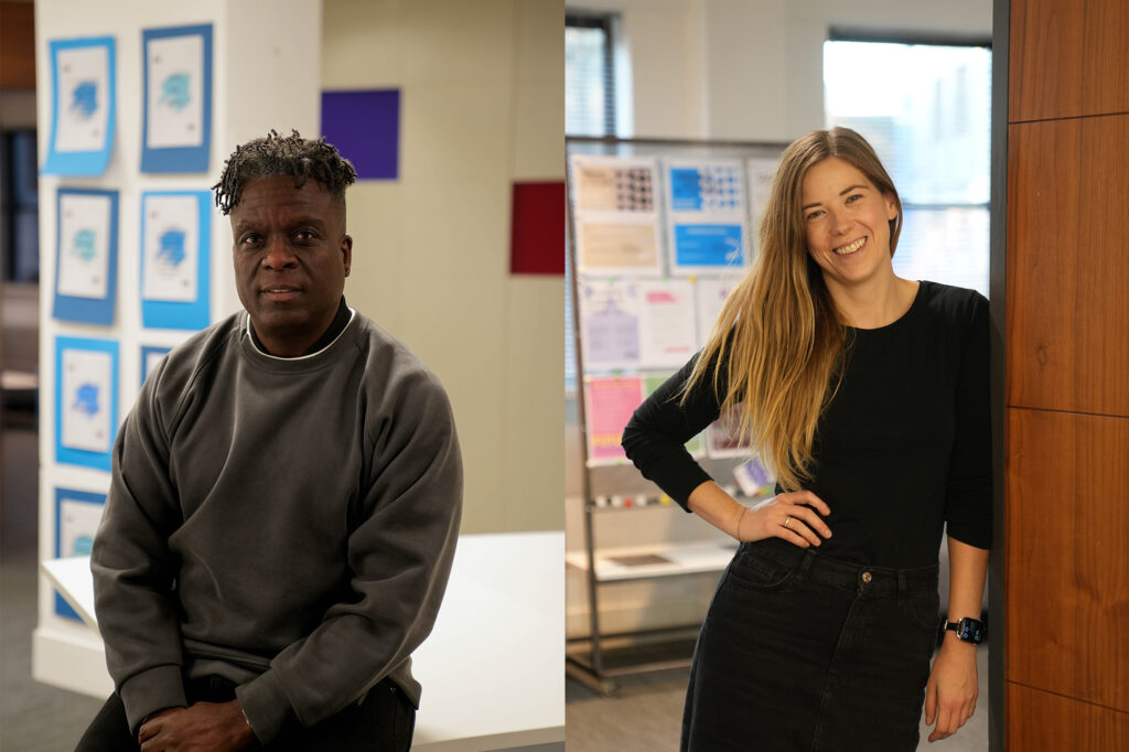
Norwich students win at D&AD New Blood Awards 2024
Norwich students were awarded a total of five pencils at D and AD New Blood Awards 2024, including two yellow, two wood and one graphite pencil.
The D&AD New Blood Awards draws thousands of entrants from graduating students across the globe, and winning any level of pencil is an incredible achievement.
D&AD is an education charity that promotes excellence in design and advertising. The D&AD New Blood Awards celebrate the best recent graduate work from across the commercial design, advertising and craft disciplines. Winning a D&AD Pencil earns graduates’ work exposure to a global audience in the creative industries and can be a platform to a future career. The competition sets briefs in partnership with some of the world’s leading brands, spanning a wide range of industries.
Further details of Norwich’s pencil winning projects are below:
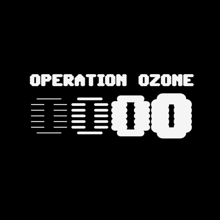 Losing the ozone layer is a big issue for humans and nature, yet human activities cause 80% of the ozone depletion, and people still tend to forget about it. After lockdown, scientists have found that the ozone layer heals itself due to fewer ozone-damaging substances being emitted from human activities to the atmosphere. To remind people and raise awareness to do good to the ozone layer, we have visualised the invisible. This environmental campaign, OPERATION OZONE uses the variable font, SixtyFour, to visualise the ozone layer thinning.
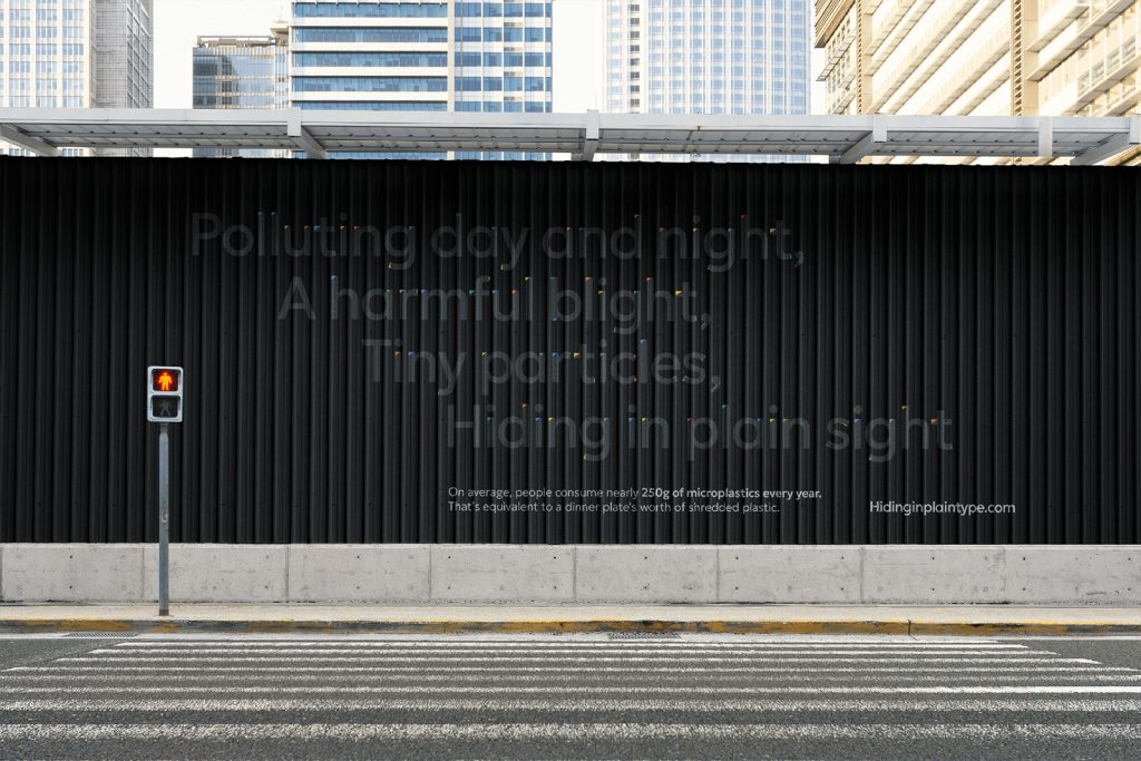
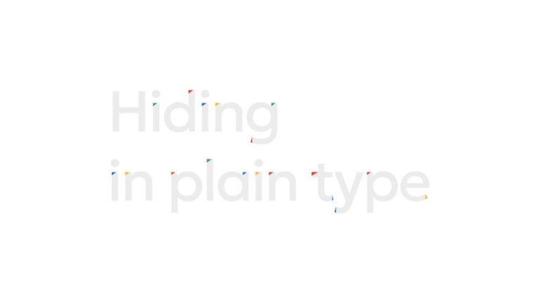 Today, microplastics can be found in our food, drinks, and air. On average, people unknowingly consume nearly 250 grams of microplastics each year. Sometimes microplastics can be so small they are practically invisible to the naked eye. In order to help tackle this issue, we need to start raising awareness. Hiding in plain type is a typographically led campaign that uses a Google variable typeface to highlight the widespread presence of microplastics in our day-to-day lives and uses poetry to help raise awareness.
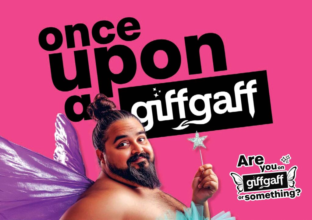
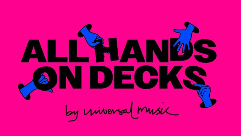 ‘All Hands on Decks’ brings the whole crew together to celebrate the hands behind the music. It is dedicated to every member of the team who has a hand in the magic and success of Universal Music.
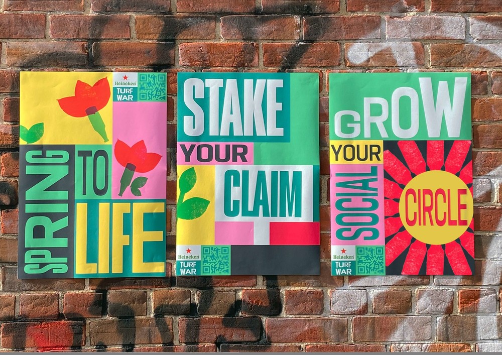
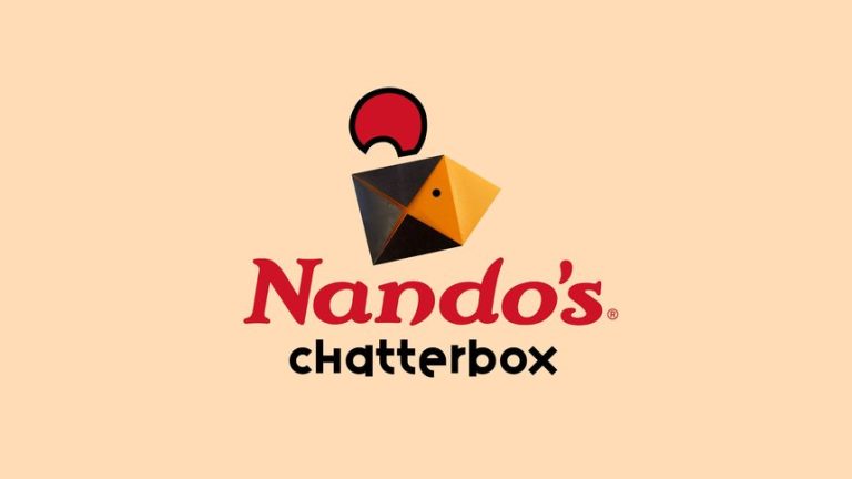 Since the pandemic, many social lives have continued to be negatively impacted, with new studies revealing the decline of in-person connection and social confidence. Chatterbox aims to bring great conversation back to the heart of the Nando’s restaurant experience. The campaign features 6 different chatterboxes containing questions and prompts to get conversation flowing, which increase in intensity according to the peri-o-meter. We want people to put the phones down, and pick up something new. Why not see what unfolds?
BA (Hons) Graphic Communication
Operation Ozone – Joe Taylor, Michael McCormack, Simon Mendoza and Troels Cheng
Yellow Pencil – Responding to a brief from Google Fonts & The Typographic Circle
Losing the ozone layer is a big issue for humans and nature, yet human activities cause 80% of the ozone depletion, and people still tend to forget about it. After lockdown, scientists have found that the ozone layer heals itself due to fewer ozone-damaging substances being emitted from human activities to the atmosphere. To remind people and raise awareness to do good to the ozone layer, we have visualised the invisible. This environmental campaign, OPERATION OZONE uses the variable font, SixtyFour, to visualise the ozone layer thinning.
Hiding in Plain Type – Gosha Maslovskis
Yellow Pencil – Responding to a brief from Google Fonts & The Typographic Circle
Today, microplastics can be found in our food, drinks, and air. On average, people unknowingly consume nearly 250 grams of microplastics each year. Sometimes microplastics can be so small they are practically invisible to the naked eye. In order to help tackle this issue, we need to start raising awareness. Hiding in plain type is a typographically led campaign that uses a Google variable typeface to highlight the widespread presence of microplastics in our day-to-day lives and uses poetry to help raise awareness.
BSc (Hons) User Experience Design
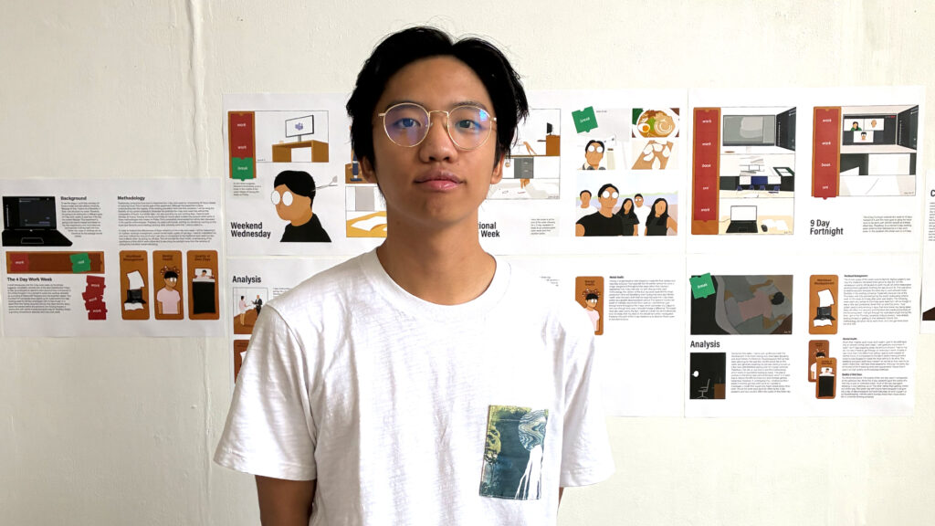
Sky Beam – Tom Wardle
Graphite Pencil – Responding to a brief from Sky An interactive projected experience that can be assisted with mixed reality glasses that provide an immersive accessible experience. A flat 2D projected image can be beamed anywhere within the boundaries set by the devices, which can be viewed on either side. A 3D projected experience for the consumption of sports, changing the way we immerse ourselves in content. Assistive AR Glasses to create an accessible inclusive experience, allowing all users to have their own personalised experience, whilst watching together.BA (Hons) Graphic Design
All Hands on Decks – Flossie Warne
Wood Pencil – Responding to a brief from Universal Music
‘All Hands on Decks’ brings the whole crew together to celebrate the hands behind the music. It is dedicated to every member of the team who has a hand in the magic and success of Universal Music.
Nando’s Chatterbox – James Leach, Jacob Boley & Jacob Brown
Wood Pencil – Responding to a brief from Nando’s & NCA
Since the pandemic, many social lives have continued to be negatively impacted, with new studies revealing the decline of in-person connection and social confidence. Chatterbox aims to bring great conversation back to the heart of the Nando’s restaurant experience. The campaign features 6 different chatterboxes containing questions and prompts to get conversation flowing, which increase in intensity according to the peri-o-meter. We want people to put the phones down, and pick up something new. Why not see what unfolds?
Related News
-
 Alumni •
Norwich ranked in QS World University Rankings for Art and Design
Norwich University of the Arts has been ranked in the 201–300 band globally for Art and Design in the latest QS World University Rankings by Subject, marking its first-ever inclusion in the internationally recognised ranking. -
 MA Communication Design •
In conversation with: Bevan Dolon, MA Communication Design
Bevan shares his design influences, creative practice and experience studying a postgraduate degree at Norwich University of the Arts. -
 East Gallery •
Sterling vs Bacon: Artists in dialogue in Olivia Sterling’s Pity the Meat! Exhibition
Pity the Meat! sees artist Olivia Sterling’s work in dialogue with the 1959 Francis Bacon painting, Two Figures in a Room. Eddy Frankel, art critic and former art and culture editor for Time Out, explores what brings them together – and sets them apart. -
 BA Animation •
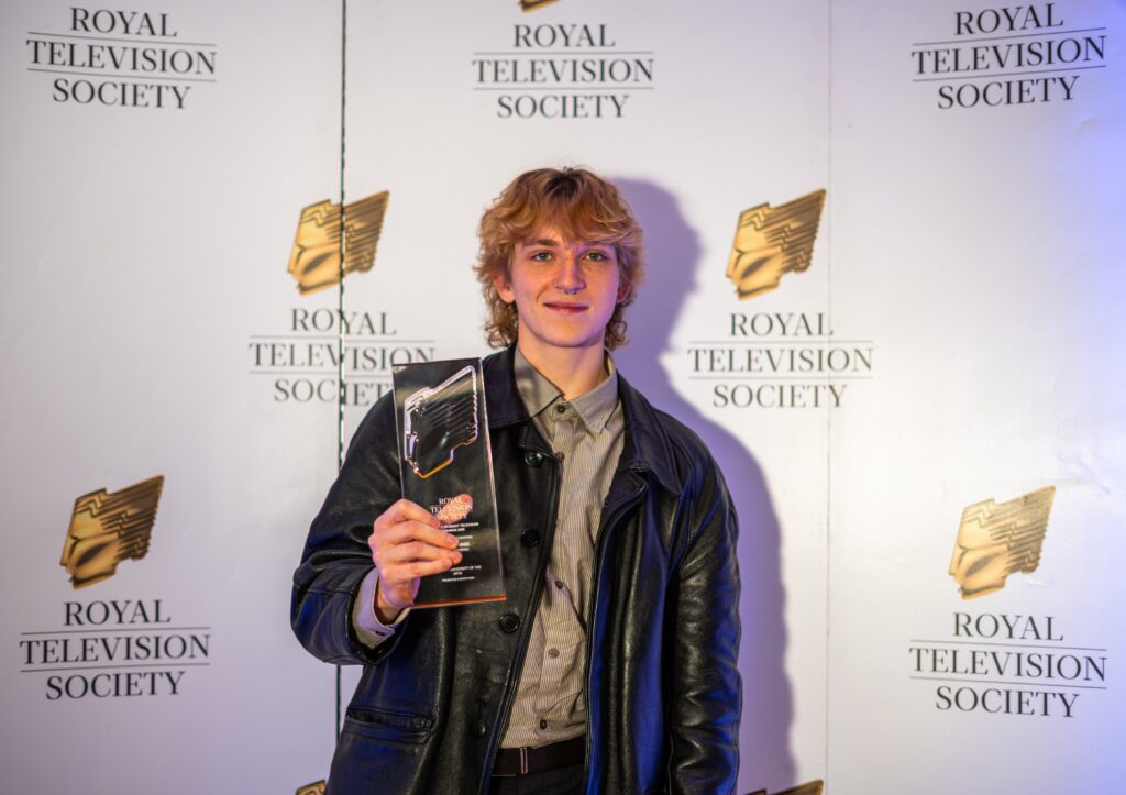
Success for Norwich Graduates at Royal Television Society East Student Awards
Norwich students were nominated across seven categories, with Henry Schwind, a graduate from BA (Hons) Film and Moving Image Production, winning the Craft – Camerawork category. -
 BA Animation •
Access and representation in a changing landscape: How women can shape the future of computer arts and technology
Access and representation remain central issues for the computer arts and technology industries. Helen Piercy, Animation Lecturer at Norwich, explores the opportunities emerging for graduates in a rapidly changing landscape. -
 Institution •
Director of Research Development collaborates with TED-Ed on new animation
Professor Alison Goodrum worked with the TED-Ed team to develop the short film which explores the history of hats. -
 Institution •
Norwich University of the Arts showcases institutional and research achievements to Research England
The University was delighted to welcome representatives from Research England, to share key institutional and research developments. -
 Institution •
Norwich appoints new Deputy Vice-Chancellor
Norwich University of the Arts is pleased to announce the appointment of Rebecca Wright as its new Deputy Vice-Chancellor. -
 BA Textile Design •
In conversation with: Lucy Perry, MA Textile Design
Lucy shares her experience of creating a 360° digital installation, in a collaborative exploration of nature and technology. -
 Institution •
Norwich University of the Arts earns prestigious 5-star QS Star Excellence rating fo Teaching
Norwich University of the Arts has been awarded an overall four-star rating in the prestigious QS Stars University Ratings, marking a significant milestone in the University’s first-ever submission to the internationally recognised assessment framework. -
 Employability •
Norwich University of the Arts celebrates 10 years of the Big Book Crit
Hundreds of Norwich students have shared their work with leading creative professionals over the last decade. -
 East Gallery •
Announcing the East Gallery Fellows 2025-2026
Norwich University of the Arts is pleased to announce the selected awardees of this year's East Gallery Fellowship. -
 BA Business Management •
Dean of Creative Education Awarded Prestigious Principal Fellowship from Advance HE
The University is delighted to announce that Hilary Carlisle, Dean of Creative Education and Professor of Design, has been awarded Principal Fellowship of the Higher Education Academy (PFHEA) by Advance HE -
 BA Degree •
Norwich University of the Arts to Host ELIA Academy 2027
Norwich University of the Arts is delighted to announce that it has been selected as the host institution for the ELIA Academy 2027. -
 BA Business Management •
In conversation with Norwich’s newest lecturers in Marketing and Business Management
We joined Norwich's newest lecturers, Stephen Balmer-Walters and Laurie McAllister, to find out more about the University's Marketing and Business Management courses. -
 BA Games Art and Design •
East of England set to become UK’s next Games Cluster, says landmark report
A major new report is calling for the creation of a Games Cluster for the East of England — positioning the region as a national leader in creative technology and immersive media.
1 / 1
Related courses
- Showing 1-2 of 3 results
-
-
Undergraduate
-
Full time
-
September
-
Graphic Communication
Graphic Communication BA (Hons)
Ignite your passion for exploring visual ideas and brand communication from real-world problems to commercial briefs, across digital and print.
-
-
-
Undergraduate
-
Full time
-
September
-
Graphic Design
Graphic Design BA (Hons)
Be inspired to apply innovative and creative solutions to branding, packaging and promotional design for commercial markets.
-